LA Kings
"In a landscape of conformity, we chose to zig while everyone else zagged."
This campaign is a love letter to the Los Angeles of my childhood: the 90s at the Forum, Gretzky and Robitaille. The aim was to put new blood into the Kings by walking away from the minimal and going maximal — grit and aggression with a sea of creativity on top.
Continuity is the backbone of any great brand, so the first job was a cohesive toolkit: typography lockups, Pantones and gradients, textures and stickers. It let a large bench of internal and external designers work fast, on-brand and on deadline from day one.
The toolkit
Brand expression proprietary to the team and the city
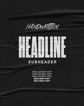
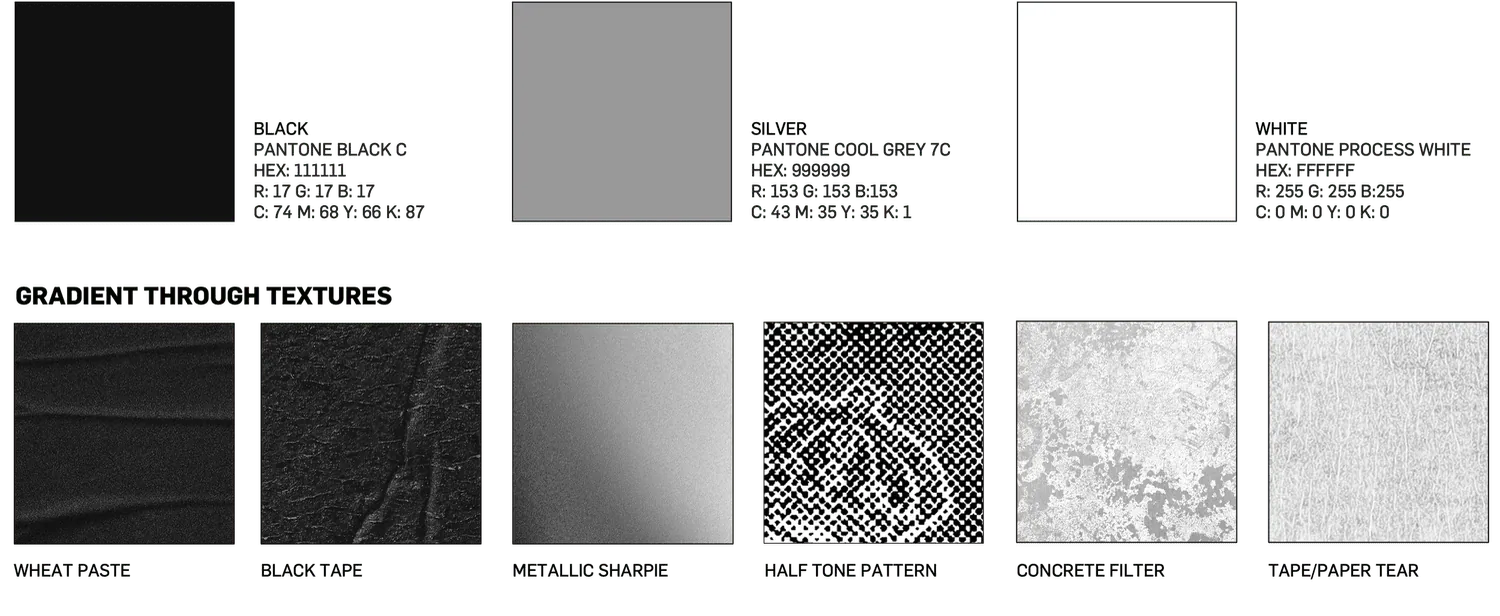
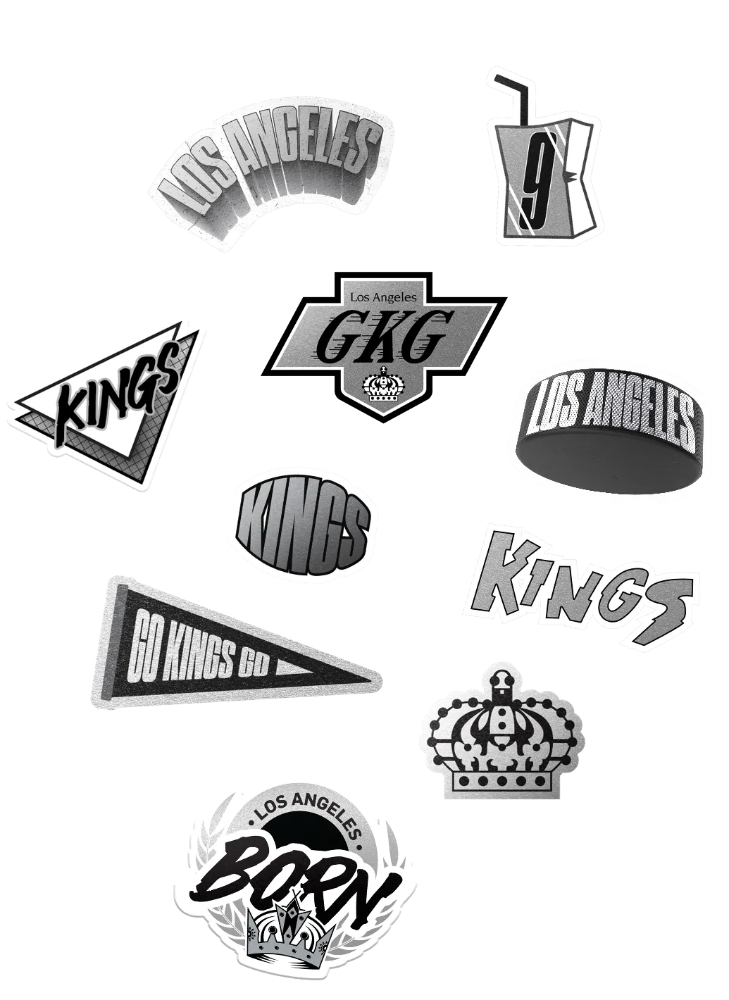
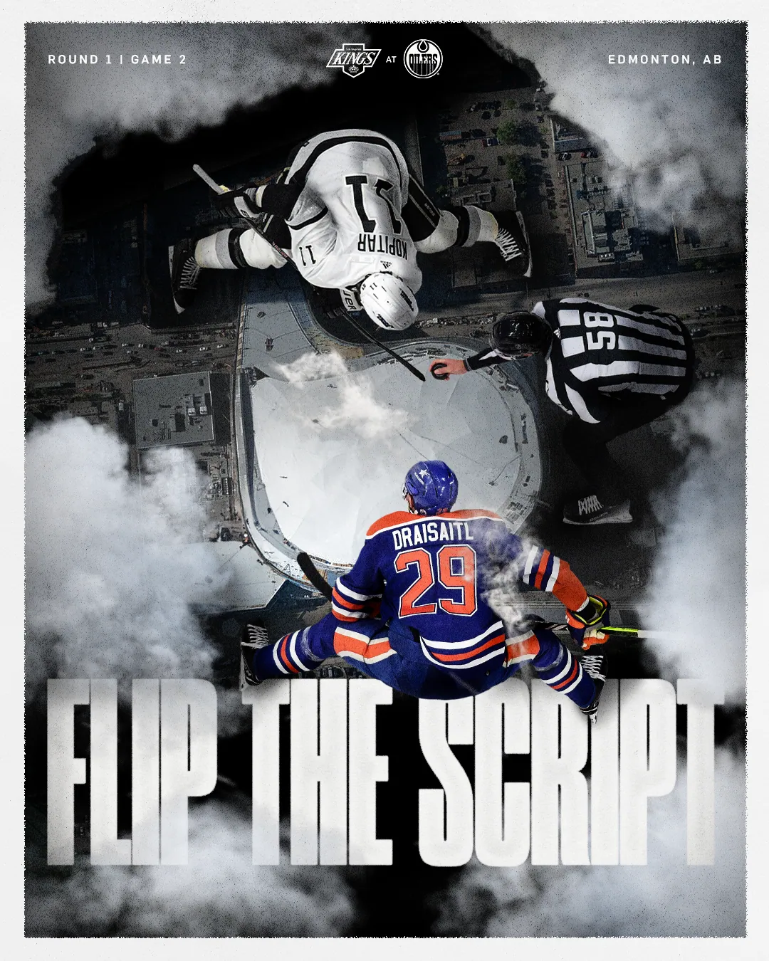

- • Meaningful evolution of brand expression, proprietary to team and city
- • Continued visual distinction between Home and Away
- • Nods to history: the Forum, crowns, speed lines, city lights
- • Lean into the 90s era of Kings hockey
Broadcast & social
You have seconds. Be impactful.
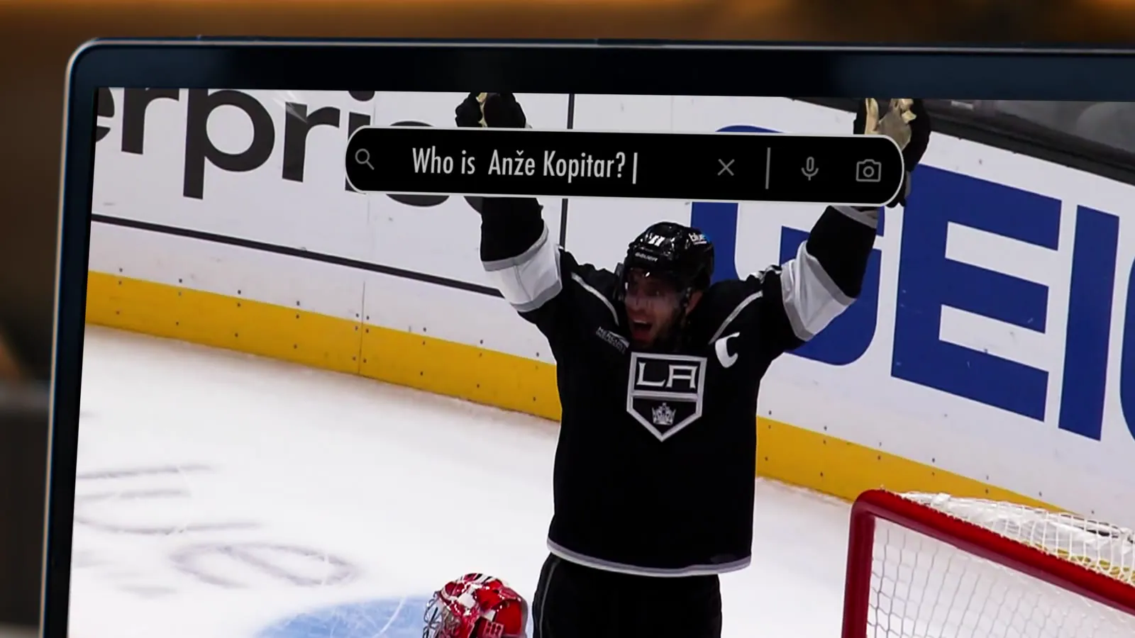
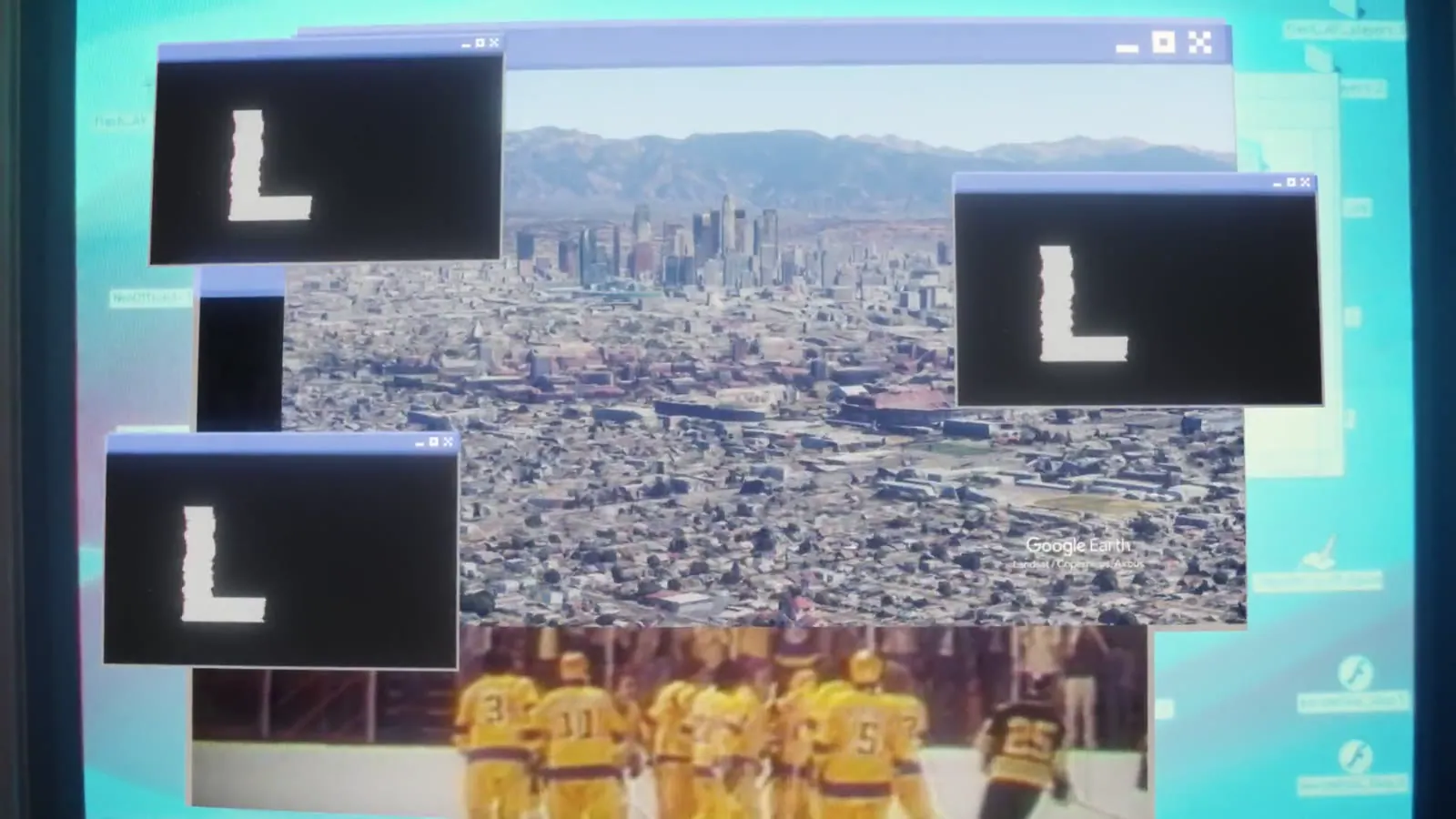

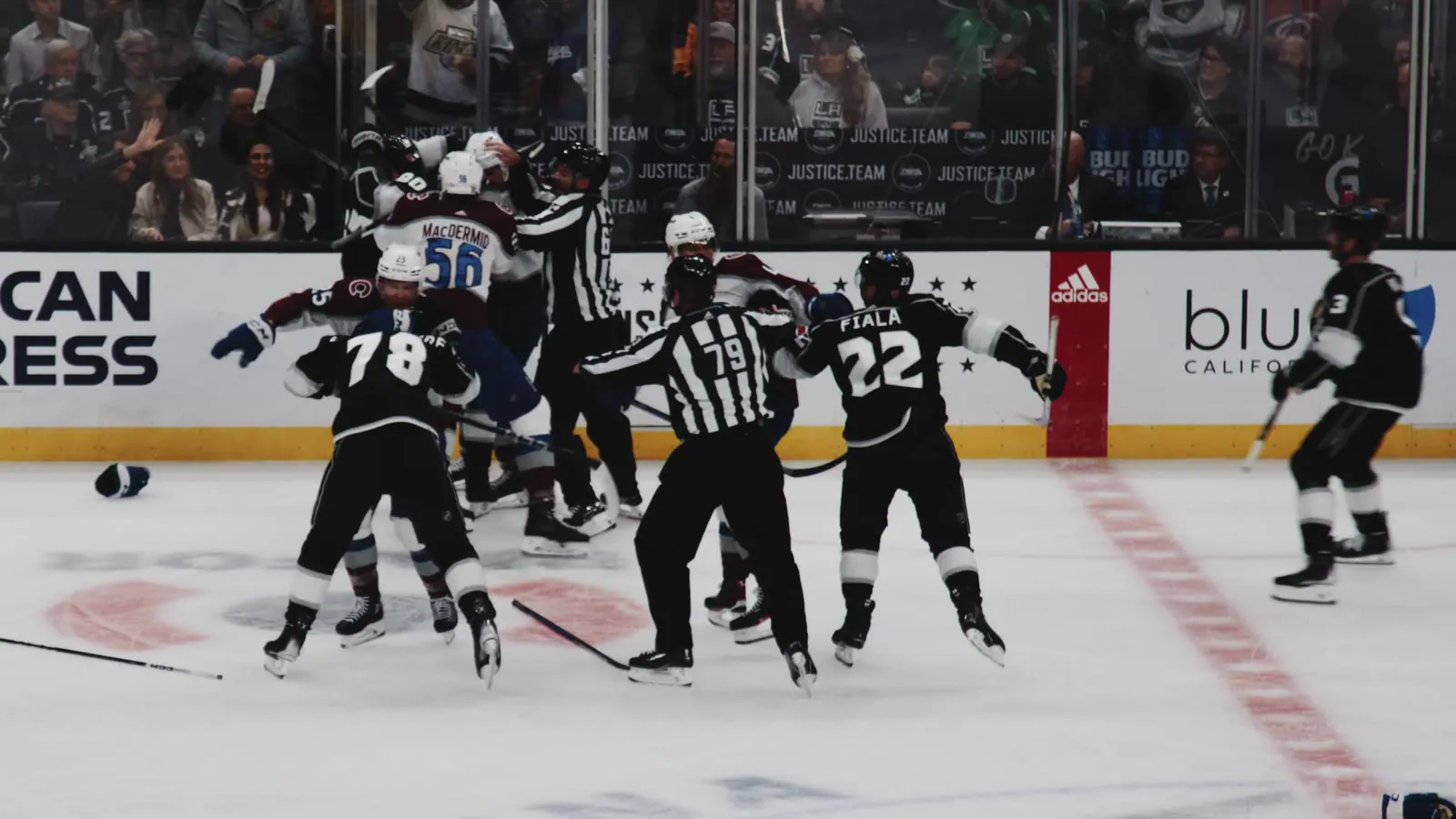
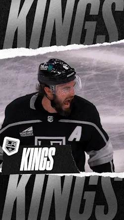
Our strategy was live motion coverage during games for maximum impact, run alongside cross-promotions with our unscripted series on CBS and KCAL — driving viewership and, ultimately, ticket sales. To reach Gen Z and Gen Alpha we collaborated with streetwear brands and other LA teams, extending the Kings into segments that had never associated with the brand.
The Black and White series by Spectrum was rebuilt with hockey ops and PR: runtime extended to 22 minutes and a grassroots partnership with CBS that opened ad-break inventory for games and Global Partnership initiatives. Drawing on the iconic Chevy and the 23–24 look, the result feels aggressive while staying true to an LA-born organization since 1967.